Tuesday, May 14, 2013
Singira Online Store
Singira Online Store is conducting an online survey, you can take part by clicking the link Click to take a survery
Thursday, April 25, 2013
The First Ever Email, the First Tweet, and 10 Other Famous Internet Firsts
 |
| PA - Twitter founder Jack Dorsey's first tweet simply said, 'just setting up my twttr' (PA) |
Here are 12 famous Internet firsts that were monumental in shaping web history.
1. The first email was sent by Ray Tomlinson to himself in 1971. "The test messages were entirely forgettable. . . . Most likely the first message was QWERTYIOP or something similar," he said.
 |
| Ray Tomlinson (Flickr via whlwcl) |
 |
| Symbolics |
3. The first website was dedicated to information about the World Wide Web and went live on August 6, 1991. Here's the url:http://info.cern.ch/hypertext/WWW/TheProject.html.
 |
| Info.cern.ch |
 |
| Gizmodo via Motherboard |
5. The first AOL Instant Message was sent by Ted Leonsis to his wife on Jan. 6, 1993.It read, "Don't be scared ... it is me. Love you and miss you."
His wife replied, "Wow ... this is so cool!" Leonsis later became AOL's Vice Chairman.
Ted Leonsis (AP Photo/Evan Vucci)
6. Joe McCambley ran the first banner ad ever online. It went live in October 1994 on HotWired.com and it promoted 7 art museums, sponsored by AT&T.

7. The first item sold on eBay (back then it was AuctionWeb) was a broken laser pointer for $14.83 in 1995. The man who bought it told founder Pierre Omidyar he collected broken laser pointers.
8. The first book purchased on Amazon was Douglas Hofstadter's Fluid Concepts and Creative Analogies: Computer Models of the Fundamental Mechanisms of Thought in 1995.
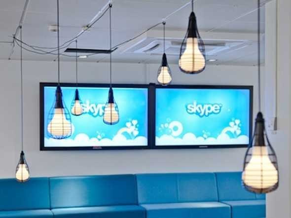
9. The first sentence uttered on Skype was in Estonian in April 2003 by a member of the development team. It was 'Tere, kas sa kuuled mind?' or "Hello, can you hear me?" in English.

10. Mark Zuckerberg was the first person on Facebook with ID number 4 (the first three Facebook accounts were used for testing). The first non-founder to join Facebook was Arie Hasit (below), who is now in Israel studying to be a rabbi.
11. The first YouTube video posted was posted by co-founder Jawed Karim at the San Diego Zoo. It was uploaded on April 23, 2005 and has been watched nearly 10 million times.
12. The first tweet was written by co-founder Jack Dorsey on March 21, 2006.
His wife replied, "Wow ... this is so cool!" Leonsis later became AOL's Vice Chairman.
 |
6. Joe McCambley ran the first banner ad ever online. It went live in October 1994 on HotWired.com and it promoted 7 art museums, sponsored by AT&T.

 |
| Daily Mobile |
 |
| Amazon |
10. Mark Zuckerberg was the first person on Facebook with ID number 4 (the first three Facebook accounts were used for testing). The first non-founder to join Facebook was Arie Hasit (below), who is now in Israel studying to be a rabbi.
 |
| BuzzFeed |
12. The first tweet was written by co-founder Jack Dorsey on March 21, 2006.
 |
| Twitter/@Jack |
3 Secure Smartphones for Business
Check out three new models with souped-up security features.

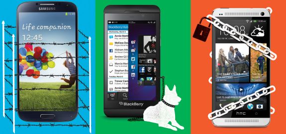
If your mobile phone contains work documents, losing it can prove disastrous for you and your business. With that in mind, more hardware companies are rolling out supersecure models. We ranked the following phones, each of which features robust 256-bit encryption, by their souped-up security features.
HTC One
SecureThe new 5-ounce HTC One features advanced options for unlocking the phone's screen, including face detection and drawing a pattern. As with the other phones here, you can fully encrypt all data on the HTC One under Settings. The Android 4.1.2 phone has front- and rear-facing cameras, a bright 4.7-inch screen, and a superfast Qualcomm Snapdragon 600 processor. Another plus? The phone lasts for an impressive 18 hours of talk time. Cost: $199 for 32GB of storage and a two-year contract with Sprint, AT&T, or T-Mobile
SecureThe new 5-ounce HTC One features advanced options for unlocking the phone's screen, including face detection and drawing a pattern. As with the other phones here, you can fully encrypt all data on the HTC One under Settings. The Android 4.1.2 phone has front- and rear-facing cameras, a bright 4.7-inch screen, and a superfast Qualcomm Snapdragon 600 processor. Another plus? The phone lasts for an impressive 18 hours of talk time. Cost: $199 for 32GB of storage and a two-year contract with Sprint, AT&T, or T-Mobile
Samsung Galaxy S 4More secure
This 4.6-ounce Android 4.2 phone includes Knox, a feature that provides extra security for work-related files and apps. Using the free Samsung for Enterprise service, your IT staff can wipe phone data remotely and require a strong password to unlock the screen. The S 4 also offers advanced unlock options, including face detection. The phone, which has a large 5-inch display and front- and rear-facing cameras, will be available this spring through several carriers, including AT&T and Verizon. Information on battery life and pricing was not available at presstime, but comparable Samsung models have retailed at $199 for 16GB of storage and a two-year contract.
This 4.6-ounce Android 4.2 phone includes Knox, a feature that provides extra security for work-related files and apps. Using the free Samsung for Enterprise service, your IT staff can wipe phone data remotely and require a strong password to unlock the screen. The S 4 also offers advanced unlock options, including face detection. The phone, which has a large 5-inch display and front- and rear-facing cameras, will be available this spring through several carriers, including AT&T and Verizon. Information on battery life and pricing was not available at presstime, but comparable Samsung models have retailed at $199 for 16GB of storage and a two-year contract.
BlackBerry Z10Most secureThis 4.8-ounce phone has a built-in, highly sophisticated security feature, BlackBerry Balance, that separates and secures work and personal information on the phone. (For example, it prevents users from pasting contents of work emails into emails in personal accounts.) IT staff can add and remove work apps remotely. The phone has a 4.2-inch touchscreen and front- and rear-facing cameras, and it lasts for about 10 hours of talk time. It comes with apps for LinkedIn and Dropbox. Cost: $199 for 16GB of storage and a two-year contract from AT&T or Verizon
Sunday, April 21, 2013
Facebook Home Hits 500K Downloads In Five Days, Pales In Comparison To Instagram’s Android Shift

It would appear that Facebook Home has just surpassed 500k downloads on Google Play since launching on the platform five days ago on April 16. The app’s Google Play listing notes the milestone, and Ben Evans confirmed on Twitter.
Facebook Home isn’t so much of an app as a user interface for the phone, putting Facebook smack dab in the center of Android user’s smartphone experience. Users with Facebook Home can post status updates and view the newsfeed straight from the lock screen, and conduct messaging without ever being interrupted thanks to Chat Heads.
In essence, it’s Facebook’s push past being an app like every other app and being a central force of the smartphone, a launch pad. Hopes are seriously high, as foreshadowed by Zuckerberg’s sweaty brow at the announcement, but word had originally circulated that users weren’t all that into Facebook Home around launch day.
Clearly, that’s not true as the app has garnered over 100,000 downloads a day since launch. Still, these aren’t blow-out numbers. Remember when Instagram launched on Android, and hit over 1 million downloads in a day? And then hit over 5 million downloads in six days? Yeah, those were blow-out numbers.
You also have to consider that Facebook has over a billion users, so 500K doesn’t really move the needle.
But in Facebook’s defense, the Home application is only available on select devices, including the Samsung Galaxy S III, Galaxy Note II, HTC One X, and the HTC One X+, along with the Facebook Phone itself the HTC First.
Oh, and Facebook is now quite happy for Instagram’s success on Android, after that slight $1 billion acquisition.
Friday, April 19, 2013
How to Protect Your WordPress From Attack

An ongoing brute-force attack on WordPress-based websites has compromised more than 90,000 blogs, but there are simple ways to make sure your blog won't be next to fall.
Brute-force attacks, as their name would suggest, are some of the least sophisticated hacks out there, rapidly cycling through common directory names, passwords and IP addresses in order to access private files through sheer dumb luck.
Given how many websites and blogs have fallen victim to the WordPress attack, the Menifee, Calif., security firm Sucuri wanted to find just how many brute-force attacks against the WordPress platform occurred on a daily basis, and how effective they were.
The bad news is that such attacks happen to WordPress blogs tens of thousands of times per day; the good news is that stopping them cold is simplicity itself.
SEE ALSO: Hackers Attack 90,000 WordPress Blogs
Sucuri examined the data logs from its own WordPress blog and discovered that between December 2012 and April 2013, hackers had launched almost 5 million brute-force attacks. Until they investigated, Sucuri's security experts had not even noticed these attempted intrusions.
The attempted hacks used very predictable patterns. To log into protected accounts, the hackers tried five usernames in overwhelming numbers: "admin," "test," "administrator," "Admin" and "root."
Tens of thousands of password attempts involved commonly used passwords like "admin," "qwerty," "123456" and "password."
The experts also investigated where the attacks came from, and discovered 30 IP addresses that stood out above the rest.
If you run a website that's been bombarded with hack attempts, check the list. Bringing attention to common attack origins is the first step toward getting them taken down.
The 90,000 WordPress blogs that got hacked and roped into joining the attacking botnetgenerally possessed easy-to-guess usernames or passwords, and their takeovers most likely could have been prevented with some creativity.
If you use common usernames or passwords for WordPress login credentials — or for any other information you store on the Web — simply changing them to something uncommon will prevent the vast majority of brute-force attacks. Making them hard-to-guess will render you all but immune.
One interesting bit of data that Sucuri gathered involved "common" passwords that didn't appear to be common at all. The attackers made thousands of brute-force attempts with passwords such as "#@F#GBH$R^JNEBSRVWRVW" and "RGA%BT%HBSERGAEEAHAEH." These strings of letters and symbols do not appear to have any kind of pattern, yet are too consistent and repetitive to be truly random.
Both the Sucuri experts and the commenters on its blog posting were stumped, and feared that brute-force hackers might know something they don't.
Our own efforts to discover the root of these supposedly common passwords came up dry. After breaking down the character strings into a binary code of 1s and 0s, we tried to translate them into other character formats, hoping that the passwords might mean something in non-Latin alphabets. Nothing recognizable came up.
Although brute-force attacks are as pervasive as Sucuri suspected, they are also very easy to avoid. If you're going to get hacked, at least make sure that the attacker has to put some effort into it.
Another Win For Flat Design As Facebook Gives Its F Logo & Other Icons A Flatter, Cleaner Look

Facebook has given its main “f” logo icon a makeover, flattening the design by removing the pale blue bar along the bottom, which gave the icon a reflective sheen/slight 3D effect, as well as moving the position of the f so it now bleeds right off the bottom. The overall effect is a simplified, unfussy and clean looking design with the f more clearly leaping out. Facebook posted the new logo as a downloadable resource for journalists today.
The refresh was flagged to TechCrunch by designer Tom Waddington who notes in a blog about the change that it appears to be part of a wider icon spring clean at Facebook, with a whole host of other icons used on various official Facebook pages also getting made over in the same flattened and more visually striking style. These icons including a developers icon, privacy- and security-related icons and a mobile icon, among others. Updates seem to have occurred last week.
Here are some of the other icon redesigns — see Tom’s blog for all the examples he’s noticed:

Flat design has spread its levelling influence all over the tech industry and its interfaces in recent years — from Microsoft’s flat, tile-based Windows Phone UI, to Google’s penchant for streamrollering its product interfaces, to scores of other apps and websites. Standing out — or rather above — all this levelling is of course Apple, which continues to prefer a skeuomorphic style of icon and interface design that tries to recreate the look of real-world objects or shapes, by incorporating shading and/or texture.
Cupertino has been roundly mocked for sticking out while the rest of the digital world is shedding pixels and going flat (there’s a great dissection of both sides of the flat vs skeuo debate here) but from a usability point of view, flat design can create confusion about which portions of the website or interface are designed to be clicked on, for instance. However when it comes to something as visible as Facebook’s f logo there seems no reason to hold onto the pale blue bar. As a marketing message, the new icon is much louder and prouder, even though it’s flatter.
According to Facebook’s logos & trademarks guidelines page, the “f” logo can be used for:
- Your Facebook Page
- Your Facebook Group
- An application you offer via Facebook Platform
- Your implementation of Facebook Connect
It’s also clearly one of Facebook’s most visible bits of brand furniture — appearing on its favicon, for instance, and its mobile app icons. The new look logo is already up and running on Facebook’s own Facebook page. While an inverted version of the logo (white square, blue f) appears on the Facebook search bar (if you have Graph search enabled). In his blog Waddington notes that the new f logo download is fully transparent, ie with the f fully cut out — which may explain the inverted search bar version.
The original f icon was designed by New York-based design house Cuban Council back in 2006 which told TechCrunch it has not worked with the logo or with Facebook since. ”Cuban Council produced the primary word mark for Sean and Mark in 2006,” Mike Buzzard wrote us in an email, “and have not worked with the logo or the company since.” His speculation is that the new icon system could be the the result of Facebook’s 2011 Sofa acquisition. Mike and some others from Cuban Council joined Google last year in an acqui-hire to work on Google+.
Facebook declined to comment when we asked about the icon redesign.
In addition to the general industry push towards flatter design, TechCrunch’s in-house Facebook stalker, Josh Constine, suggests the decluttered design could be a sign of internationalisation — i.e. to better communicate the Facebook brand to non-English language users who may have been confused by the horizontal line apparently connecting and extending the f symbol. He notes that the original design was conceived when Facebook was a domestic company targeting just U.S. users.
LulzSec Member Sentenced to Year in Prison for Sony Hack

A member of the LulzSec hacker group was sentenced to one year in prison for breaching Sony's servers in June 2011, Reuters reports.
Cody Kretsinger, who pleaded guilty in April 2012 to charges of conspiracy and authorized impairment of a protected computer, will also have to perform 1,000 hours of community service once he gets out of prison.
The sentence is a part of a plea bargain that helped Kretsinger — also known by his online moniker "Recursion" — avoid a maximum sentence of 15 years in prison.
The Sony Pictures hack, which exposed more than 1 million user accounts, was the largest in a long series of hacks performed by members of LulzSec. The group took credit for the attack, posting the stolen user info on its (now defunct) website.
The attack caused Sony more than $600,000 in damage, prosecutors said.
8 Ways to Improve Your 'About Us' Page
Chances are, it's one of the most-visited pages on your site. It's probably also the weakest. Here's how to fix it.


Which page of your website gets the most visitors? If you're like most businesses, your About Us page is at or near the top of the list.
That's great--unless you treat your About Us page as an afterthought.
After your site gets potential customers interested in your products or services, they naturally head to your About Us page--often within three to four clicks--to make sure your company is the right choice to provide those products and services. That's why your About Us page is often your website's make or break page.
Of course writing about yourself and your business is awkward, so many About Us pages read something like this:
"NextBigThing Technologies is a global solutions provider that redefines enterprise networking and connectivity by providing a unique blend of innovative world-class services and outstanding customer experiences."
Sounds impressive, especially if you like buzzwords. But it says nothing.
So take a different approach. Make sure your About Us page gives potential customers what they need to feel comfortable choosing you:
Start with the customer's needs.
Forget what you do. Customers don't care about what you do; they care about what they receive: solutions and benefits.
So what do potential customers want to know? At a basic level, first-time visitors want to know you own a real business with real capabilities. What questions do customers typically ask during sales calls? What information tends to seal a deal or win over a hesitant customer?
If I want to outsource product fulfillment, "providers of outstanding customer experiences" means nothing to me, but "99.7% on-time shipping with a .0021% error rate for the past five years" means a lot--because it means you care about, measure, and deliver a service critical to my business.
Think facts, not superlatives.
Many About Us pages are filled with words like visionary, outstanding, disruptive, excellent, world-class, cutting edge...
If your business really is outstanding, give me facts: I'll decide if you're outstanding. If your business really is visionary, tell me about cool products you've developed: I'll decide if they're visionary.
And if you're a new business and don't have facts and figures, don't make them up. Describe what your business hopes to achieve and how you plan to achieve it. Give me the chance to decide if I want to jump on board with you.
Never try to be something you're not.
Check out a few About Us pages: Generally speaking, the smaller the business the "fluffier" the content.
Fluff is boring. Candor is compelling. Be who you really are and make that your advantage.
If you're a start-up, own it. If you're bootstrapping, own it. Start-ups are cool, and so is bootstrapping. Describe how new clients will benefit from the fact you're new or small: You can put more focus on individual customers, you can provide shorter lead times, you'll take relatively small orders so you can prove yourself in a new market, etc.
Speaking of being who you are...
Use real photos.
Always use photos of real people and places. If you can't, don't use any photos.
And don't let your Web folks convince you to use stock photos in order to add visual appeal to the page. We're all experts at spotting stock photos.
The pretty boy wearing an ill-fitting hard hat and pretending to read blueprints doesn't add visual appeal. He just looks silly.
Streamline your accolades.
Certifications are important, except when they're not.
If I want to build a sustainable facility, finding an engineer with LEED accreditation may be important. If I want a wedding photographer, finding one who is a member of the Wedding Photojournalist Association may not be so important, especially since the acceptance requirements are easy to meet.
Awards can also add credibility, but pick the few that make the most impact on potential customers. (If you can't stand the thought of leaving any awards out, create a separate "Industry Awards" page and get all crazy with your self-congratulatory self.)
So if you won a Tony award, it's probably okay to leave out your "Best Ensemble Dancer in a Comedy or Drama at Curly Joe's Dinner Theater and Swap Shop" award.
Never stop tweaking.
A great About Us page should be a work in progress. Whenever you land major customers, add expertise and capabilities, enter new markets, open new locations, etc., update your About Us page right away.
Make sure your About Us page always matches what you would say if I asked you about your company today.
Play pop quiz.
Ask people who know little or nothing about your business to read your About Us page and then describe what you do. If they can't answer most of the five Ws (who, what, when, where, why), get back to work.
By the way, that's a perfect task for all those social media connections you have but never actually seem to connect with. Asking for input is a great reason to reach out, and most people will be flattered by the fact you want their opinion.
Finally, get over yourself.
If you're fairly modest, writing your About Us page feels salesy and self-congratulatory, so you stop short of describing your business accurately. If you aren't particularly modest, writing your About Us page is really fun, so you go way over the top.
Either way, get over yourself. The end result is too important. Fortunately it's easy: Just focus on facts, figures, and accomplishments. Objective information is a lot easier to write.
It's more powerful, too. Simply think about the needs you fulfill and the problems you solve for your customers.
Then use plain language to describe how you fulfill those needs and solve those problems. Use plain language to describe who you really are.
That's the best way to establish credibility and help potential customers decide you're the best choice--because ultimately people do business with real people, not with companies.
Wednesday, April 17, 2013
5 Reasons to Blow Up Your Current Website
Be honest: Is that Web design as attractive as it was five years ago? Here are key signs it might be time to rebuild.

I've received a decent number of compliments on my website over the years. To be sure, it's a pretty good one and it has served me well, but I've decided that it's time for a makeover. In this post, I'll list five conditions that almost always necessitate building a new site.
You acquire a new--and sexier--domain.
This one is a no-brainer. After years of trying I recently acquired www.philsimon.com. What better way to announce the new site than redesigning it? (As of this writing, the new site is under development.) Related to this, what if your company is launching a new product? In my case, both things are true. (My new book will be out in about a month.)
Your current site can only host so many pages.
Far too many people think of websites and content management systems as one in the same. They're not. Static websites resemble brochures; they aren't designed to enable users to easily add content. On the other hand, CMSs were conceived with nearly unlimited capacity for content of all types: videos, podcasts, and text. For many reasons, SEO favors sites with many pages over sites with very few. Think about it.
Your current site appears long in the tooth.
A theme or design from 2006 might look a bit dated now. After all, the Web has changed a great deal over that time. It's folly to assume that Web design has remained static. I wrote a few months ago that Pinterest has had a significant impact on design. If your site is image-challenged, it may be time to consider redesigning it.
Your current site isn't mobile-friendly.
Fellow Inc.com columnist Hollis Thomases writes that "Mobile now accounts for 12% of global Internet traffic, and it's scaling faster than the desktop did." It doesn't take a sorcerer to see what's coming. Yes, there are WordPress plug-ins that effectively simulate a mobile site. That's a bit like getting a little bit pregnant. Why not embrace mobile completely and get a responsive theme?
The performance of your current site is suffering.
My old site, www.philsimonsystems.com, held its own for more than three years. However, I just had too many images and plug-ins running in the background, most of which I felt I needed for different reasons.
Fast forward to 2013 and new development frameworks like Twitter Bootstrap obviate the need for a great deal of Band-Aid functionality. That is, these frameworks "ship" with many neat features baked in.
Simon Says
Websites age over time--some better than others. Think about how your site looks relative to your competition. Are you really putting your best foot forward?

Friday, April 12, 2013
Just Who Uses Social Media? A Demographic Breakdown

You think you know social? How about who uses it? Well, you might not know it as well as you would have guessed.
A new study from the Pew Research Center and Docstoc shed some light on just who uses social and on what platforms. Some of the findings seem in line with what you would probably guess, but others were surprising.
If you think the smarter, more attractive sex is more socially prolific than us men, well ... you're right. Women use social media 9% more than men do. Despite having more distractions, people living in cities have the most social media activity, at 70% of the population. Perhaps it's the connectivity of large-city life.
In terms of racial and ethnic groups online, Hispanics lead the pack at 72% engagement, with African-Americans trailing at 68%, who are ahead of Caucasians at 65%. And in a strange twist, despite being somewhat economically disadvantaged, 72% of adults with annual household incomes below $30,000 use social networks, more than those with higher wages.
How about most popular social networks? That would be Facebook, with 67% of adults using the Zuckerberg-founded service. A distant second was LinkedIn with 20%, with Twitter coming in third at 16%, and Tumblr falling dead last at 6%.
Take a look at the details below:

Wednesday, April 03, 2013
LEAKED: Here's What Facebook's New Phone Software Will Look Like
Facebook is reportedly set to announce new software for Android, Google's mobile software, tomorrow.
Today, @evleaks, an anonymous mobile leaker, posted photos of what it's going to look like at 9to5Google. Facebook's modification of Android appears to make the operating system simpler.
By most accounts, Facebook isn't totally taking over Android. It's just providing a "skin," or its own layer of design atop the operating system. This is widespread with Android. HTC and Samsung each have their own tweaks to Android. HTC has "Sense" and Samsung has "TouchWiz".
This is just going to be the Facebook "Home" or something like that.
Yesterday, @evleaks published a photo of the HTC First, which will be the new phone Facebook uses to demonstrate the new Android software. According to the leaked specs, it'll be a mid-range phone with relatively weak specs.

Tuesday, April 02, 2013
Yahoo Buys A Mobile News Startup Founded By A 15-Year-Old For $30 Million

Yahoo announced today that it has acquired Summly, a mobile news aggregation app from British entrepreneur Nick D'Aloisio.
D'Aloisio is only 17-years-old. When he started Summly, he was only 15.
Summly scans the Web for news and uses an algorithm to find the type of content you want to read. Then it summarizes it for you.
Yahoo is going to shut down Summly as a stand alone app, but it says
it's going to incorporate Summly technology into its own mobile apps and
sites.
Clearly, Yahoo CEO Marissa Mayer wanted to hire D'Aloisio. She has
been making a lot of small acquisitions like Summly. She wants to bring
young, fresh, mobile-focused talent to Yahoo.
Humoursly, Aaron Levie, CEO of cloud storage company Box, notes on Twitter that D'Aloisio was born after Yahoo was founded.
There was no price announced with the deal. However, All Things D reporter Kara Swisher says Yahoo paid just under $30 million. The app generated no revenue.
According to Crunchbase, Summly has raised $1.53 million in venture funding from an impressive list of investors.
 |
| Summly |
Hong Kong billionaire businessman Li Ka-shing put $300,000 in the
company in September of 2011. A year later, the rest of the money came
from people like Brian Chesky, the CEO and founder of AirBnb, Mark Pincus, the founder and CEO of Zynga, Ashton Kutcher, Yoko Ono, Wendy Murdoch, and a few other big names in tech.
When Steve Jobs opened the iPhone's App Store, Nick D'Aloisio was only 12-years-old.
D'Aloisio taught himself how to make an app. Three years later he
launched his own startup, Trimit, which truncated a news story into 140
characters for people that wanted to tweet out stories.
He realized people didn't want to truncate the news. They wanted the
news truncated for them. So, he flipped the app and made Summly.
Previously it was reported Summly only had 500,000 downloads, which
is not much for an app. D'Aloisio says Summly has had "90 million
summaries read," whatever that metric means.
Here's the release from Yahoo announcing the deal:
Today, we’re excited to share that we’re acquiring Summly,
a mobile product company founded with a vision to simplify the way we
get information, making it faster, easier and more concise.
At the age of 15, Nick D’Aloisio created
the Summly app at his home in London. It started with an insight -- that
we live in a world of constant information and need new ways to
simplify how we find the stories that are important to us, at a glance.
Mobile devices are shifting our daily routines, and users have changed
not only what, but how much information they consume. Yet most articles
and web pages were formatted for browsing with mouse clicks. The ability
to skim them on a phone or a tablet can be a real challenge -- we want
easier ways to identify what’s important to us.
Summly solves this by delivering
snapshots of stories, giving you a simple and elegant way to find the
news you want, faster than ever before. For publishers, the Summly
technology provides a new approach to drive interest in stories and
reach a generation of mobile users that want information on the go.
Nick and the Summly team are joining
Yahoo! in the coming weeks. While the Summly app will close, you will
see the technology come to life throughout Yahoo!’s mobile experiences
soon. So stay tuned!
Mobile devices are at the center of how
we engage with the people, experiences and interests we love. Across
Yahoo!, we’re focused on creating beautiful experiences that people are
excited to use every day -- products that inspire and delight. We can’t
wait to work with Nick and the Summly team to do just that.
And here's Summly's announcement:
In true Summly fashion, I will keep this short and sweet.
I am delighted to announce Summly has
signed an agreement to be acquired by Yahoo!. Our vision is to simplify
how we get information and we are thrilled to continue this mission with
Yahoo!'s global scale and expertise. After spending some time on
campus, I discovered that Yahoo! has an inspirational goal to make
people's daily routines entertaining and meaningful, and mobile will be a
central part of that vision. For us, it's the perfect fit.
When I founded Summly at 15, I would have
never imagined being in this position so suddenly. I'd personally like
to thank Li Ka-Shing and Horizons Ventures for having the foresight to
back a teenager pursuing his dream. Also to our investors, advisors and
of course the fantastic team for believing in the potential of Summly.
Without you all, this never would have been possible. I'd also like to
thank my family, friends and school for supporting me.
Most importantly, thank you to our
wonderful users who have helped contribute to us receiving Apple's Best
Apps of 2012 award for Intuitive Touch! We will be removing Summly from
the App Store today but expect our summarization technology will soon
return to multiple Yahoo! products - see this as a ‘power nap' so to
speak.
With over 90 million summaries read in
just a few short months, this is just the beginning for our technology.
As we move towards a more refined, liberated and intelligent mobile web,
summaries will continue to help navigate through our ever expanding
information universe.
Sincerely,
Nick
Founder
Founder
Here's a demo video of Summly, which helped launch it:
Monday, April 01, 2013
Twitter gets into April Fools' action, announces vowel-less 'Twttr' service
Who needs vowels, right? Especially if you’re on Twitter and already hate the 140-character limit on the micro-blogging site. Twitter has announced that it is going to launch a new service called Twttr that will skip the vowels and will turn the main site Twitter into a $5 a month premium service. Of course, one needs to keep in mind that it’s April Fool’s day today.
“Starting today, we are shifting to a two-tiered service: Everyone can use our basic service, Twttr, but you only get consonants. For five dollars a month, you can use our premium 'Twitter' service which also includes vowels,” the scl ntwrk wrote in a blog post.
Being very considerate, though, Twitter has letter “Y” for free. Saying that the letter “Y” will be free, “always and forever,” Twitter also said that vowels in URLs will also be free of charge. These changes will thankfully not be rolled over to Twitter users who access the website in other languages.
Twitter is also expanding the length of tweets to 141 characters (yayy!) from the original 140, “for those moments when you need just one more character to finish your thought.” This extra character will come with a price tag, sadly. Using a bidding system, Twitter will decide the price of the extra character keeping in mind its demand at the time. You can choose to go over limit with one character, not two, said the social networking website.
So how did this genius idea come about? Michael Sippey, Twitter’s VP of Product said, “I was carpooling home after Twitter’s seventh birthday party. With my head filled with images from our past, like our early logo where we spelled it TWTTR, in neon green toothpaste. And then Prince’s song “I would die 4 U” came on the radio. I felt like there was something there, but I wasn’t sure what or how to bring it to market.
Then later that night, I was watching “Wheel of Fortune” with @adambain, and a contestant yelled out ‘I wanna buy a vowel’. Everything just sort of clicked. Adam and I turned to each other and high-fived. It was one of those product moments that just felt like magic.”
Twitter said that it has already started testing Twttr with a small group of users, and this change will be rolled out to 100 percent of them over the next few days. Very considerately Twitter has advised users to practice tweeting with merely consonants and the letter “Y”. It has made available hashtags #novwls for people on Twtter and #icanhashashtag for users on premium Twitter.
A website that converts your Tweets into “Twts” has also been provided. Heading to the website will write a tweet out for you to send to your followers, letting them know you’ve been April Fooled by Twitter.
Twitter joins the ranks of other companies who are pulling gags on the internet today. Google has launched a bevy of prank services including Google Nose, a website that allows you to smell products using your monitors. Google also announced that YouTube would be shutting down in order to find the best video, before the service launches again in 2023 with just the winning video.
“Starting today, we are shifting to a two-tiered service: Everyone can use our basic service, Twttr, but you only get consonants. For five dollars a month, you can use our premium 'Twitter' service which also includes vowels,” the scl ntwrk wrote in a blog post.
 |
| World's most retweeted tweet on Twttr |
Twitter is also expanding the length of tweets to 141 characters (yayy!) from the original 140, “for those moments when you need just one more character to finish your thought.” This extra character will come with a price tag, sadly. Using a bidding system, Twitter will decide the price of the extra character keeping in mind its demand at the time. You can choose to go over limit with one character, not two, said the social networking website.
So how did this genius idea come about? Michael Sippey, Twitter’s VP of Product said, “I was carpooling home after Twitter’s seventh birthday party. With my head filled with images from our past, like our early logo where we spelled it TWTTR, in neon green toothpaste. And then Prince’s song “I would die 4 U” came on the radio. I felt like there was something there, but I wasn’t sure what or how to bring it to market.
Then later that night, I was watching “Wheel of Fortune” with @adambain, and a contestant yelled out ‘I wanna buy a vowel’. Everything just sort of clicked. Adam and I turned to each other and high-fived. It was one of those product moments that just felt like magic.”
Twitter said that it has already started testing Twttr with a small group of users, and this change will be rolled out to 100 percent of them over the next few days. Very considerately Twitter has advised users to practice tweeting with merely consonants and the letter “Y”. It has made available hashtags #novwls for people on Twtter and #icanhashashtag for users on premium Twitter.
 |
| April Fools! |
A website that converts your Tweets into “Twts” has also been provided. Heading to the website will write a tweet out for you to send to your followers, letting them know you’ve been April Fooled by Twitter.
Twitter joins the ranks of other companies who are pulling gags on the internet today. Google has launched a bevy of prank services including Google Nose, a website that allows you to smell products using your monitors. Google also announced that YouTube would be shutting down in order to find the best video, before the service launches again in 2023 with just the winning video.
Subscribe to:
Posts (Atom)